BrightLocal was one of many look-alike platforms in a congested local SEO market, and revenue had been flat for two years. I was brought in to give it a distinct brand and a lane of its own. Over three years, annual revenue doubled.
- Role
- Creative Director
- Team
- Scaled from 4 to 16
- Timeline
- 2022 – 2025
- Scope
- Brand strategy, identity, design system, product, events
Before
One of many look-alike platforms in a congested market. Revenue flat at around £10M for two years.
After
A distinct brand in a lane of its own. Revenue at around £20M, and enterprise brands coming to it.
2×
Annual revenue, from around £10M to around £20M
58
NPS, up from 26
£1.2M
Revenue from a single conference stand
+24
Brand score points across a two-day event
01 — The problem
A brand nobody could pick out
When I joined as Creative Director, revenue had sat at around £10M for two years. Tens of thousands of people signed up for a free trial every week, and only about 2% came back on day two.
I ran a simple test. I removed the logos from 15 competitor landing pages and asked BrightLocal's own staff to find their website. Most couldn't.
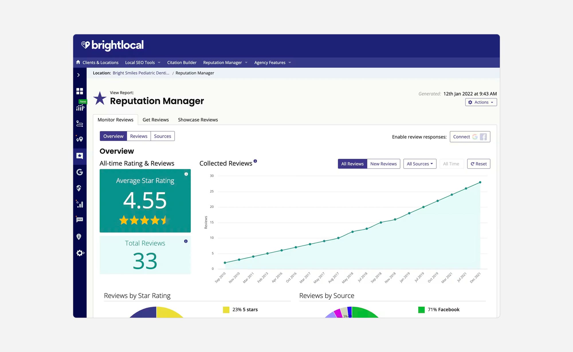
The gap ran the other way too. The marketing looked polished and modern, but the product behind it looked like a different company. Users said they felt misled, and that distrust was driving churn.
02 — Discovery
Three groups, three very different stories
Before designing anything I met every department head, from the CEO to Customer Success, and mapped where each believed the stagnation came from.
Then I pushed the company to run its first ever customer survey, alongside three focus groups: paying users, users who had churned, and people who tried the free trial and never converted. The same three findings came back from every group.
- 01
A trust gap
What people saw in the marketing didn't match what they met in the product.
- 02
No guidance
New users were dropped into the tool and expected to learn it from 15-minute videos.
- 03
No difference
The two competitors who were winning had a distinct presence. BrightLocal had none.
03 — Brand strategy
A skate brand meets a local SEO company
There were no principles to design against, so I started there: delight customers, make it intuitive, and be visually distinct from everyone else in the category.
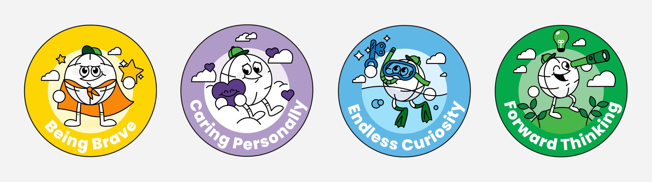
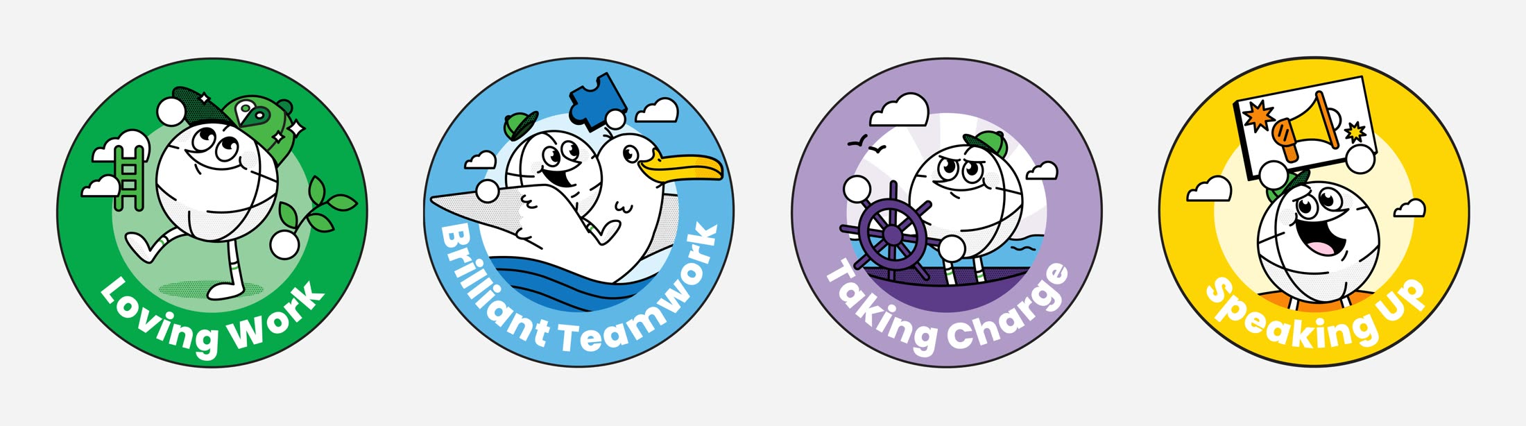
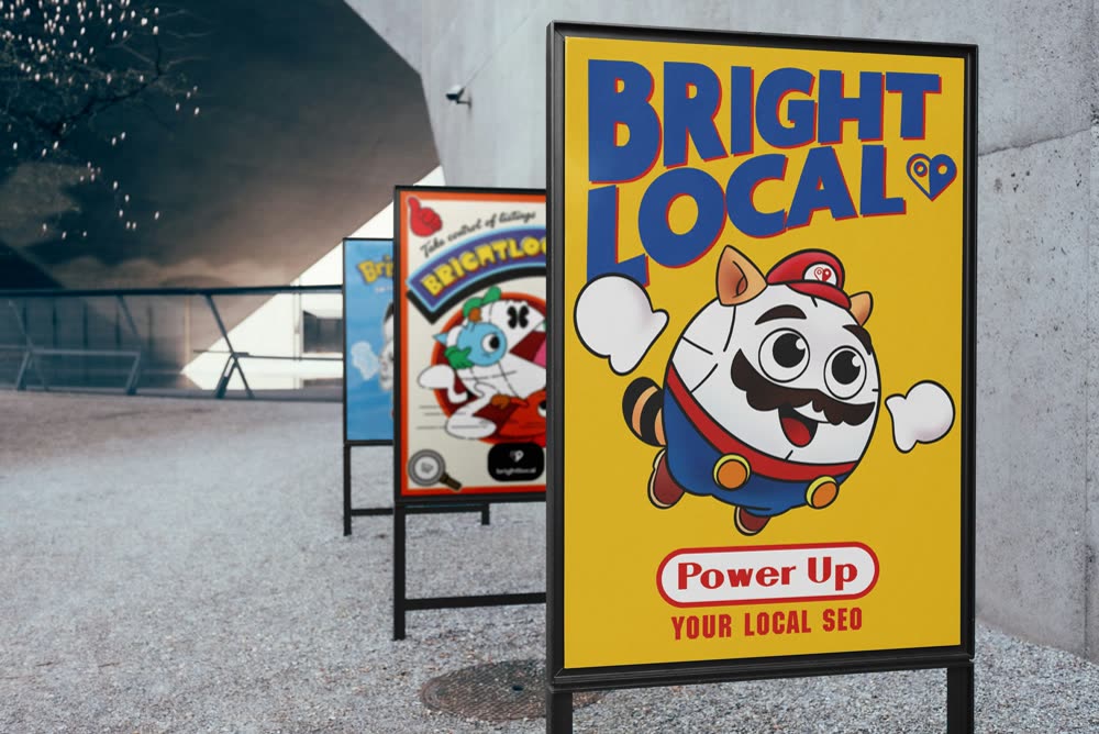
The personality came from who the company already was. Independent, welcoming, a bit of an upstart, based in Brighton. I positioned it as a skate brand that happens to do local SEO.
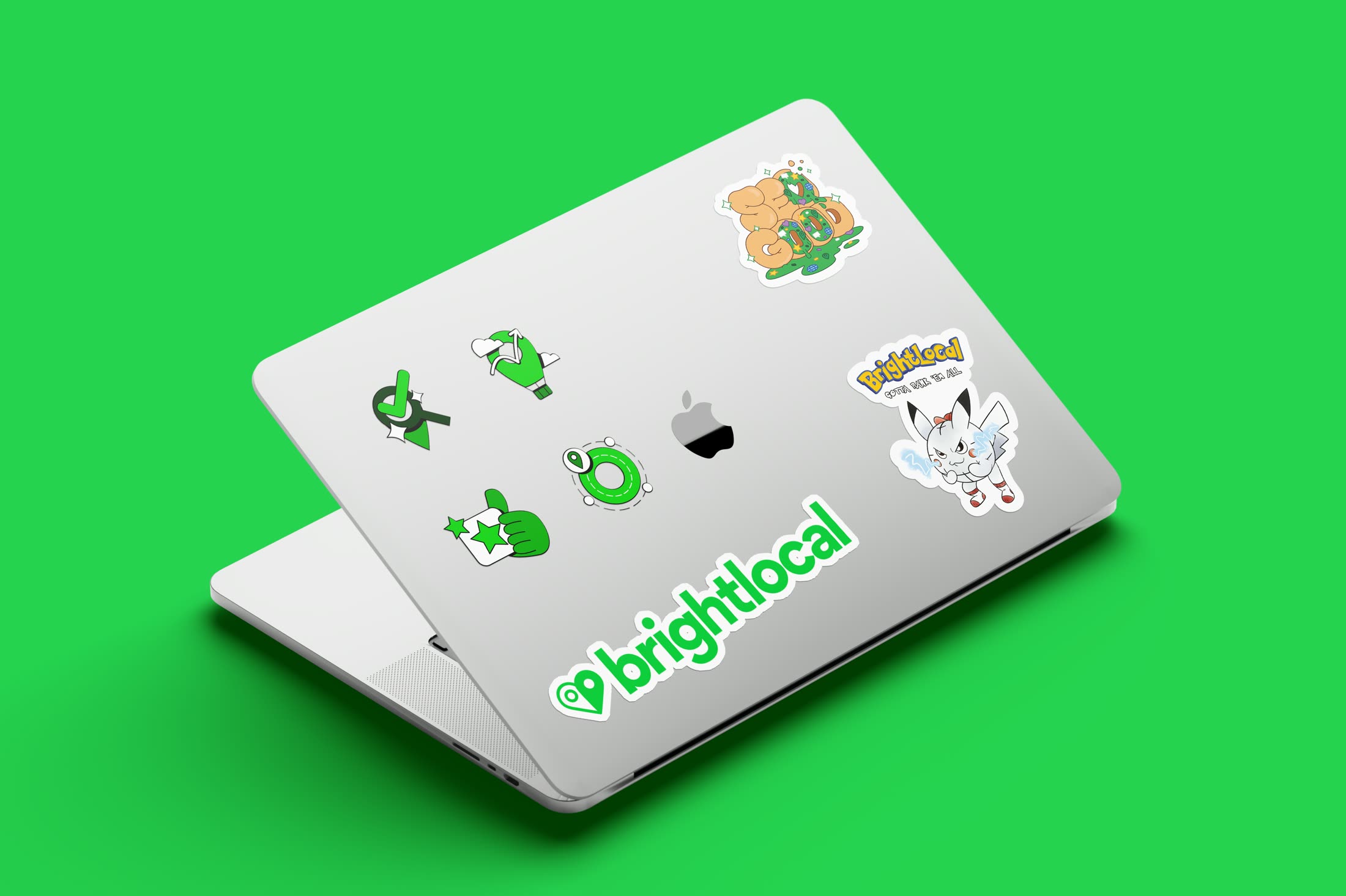
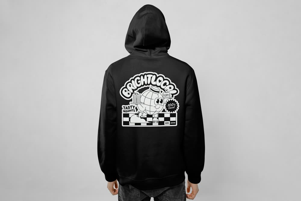
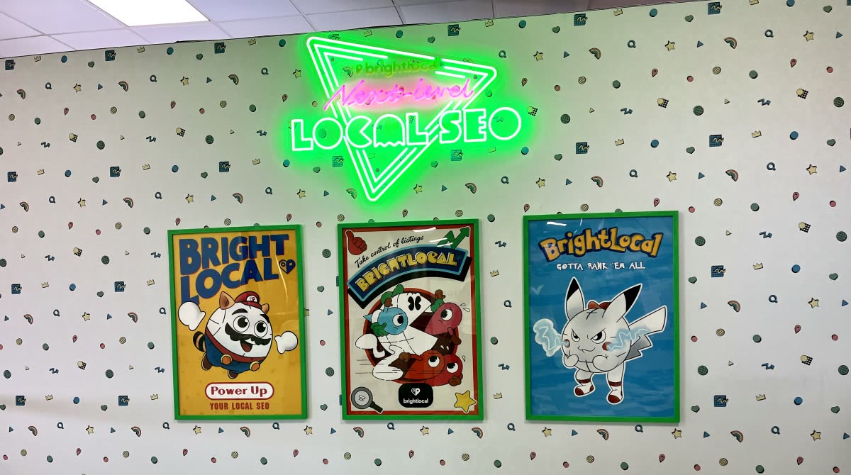
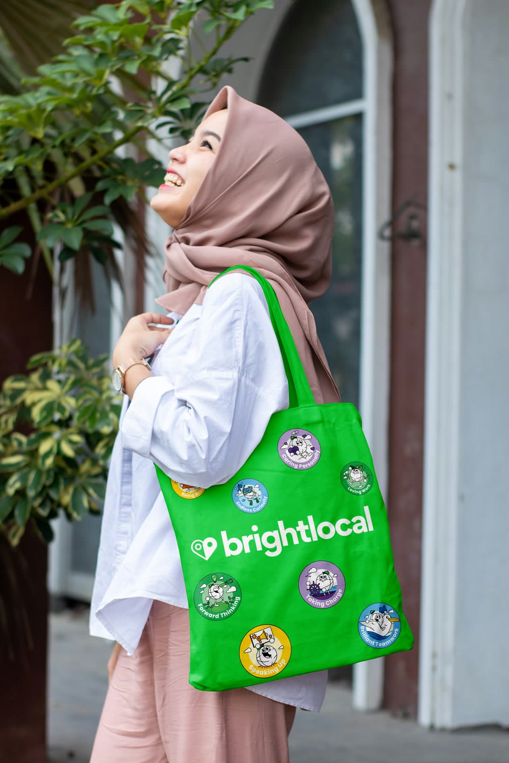
I didn't design the identity and then adapt it for the product. The illustration style, the design system and the mascot were built as one system, and the mascot went on to become a companion character inside the tool.
The brand then had to show up wherever people would meet it: in the product, in the BrightLocal Academy, and at conferences and trade shows.

04 — Design system
One system for brand, website and product
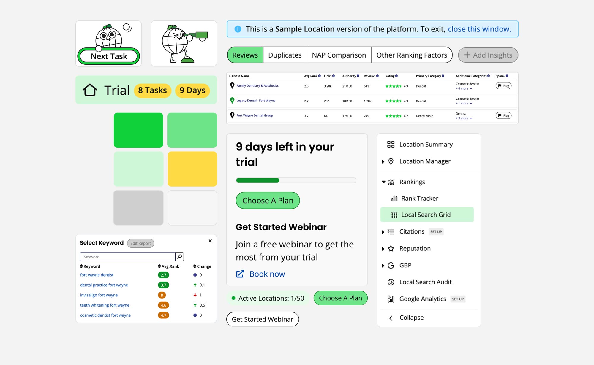
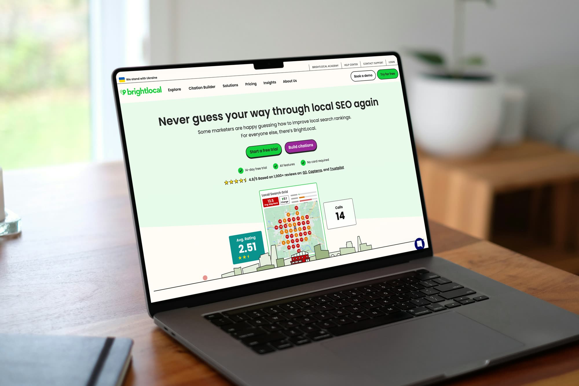
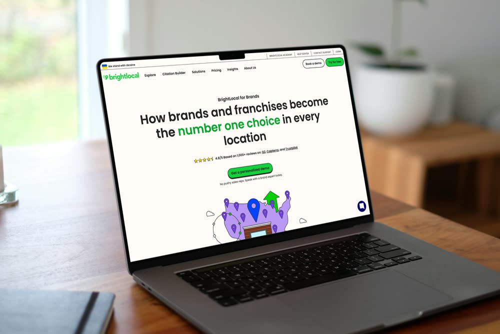
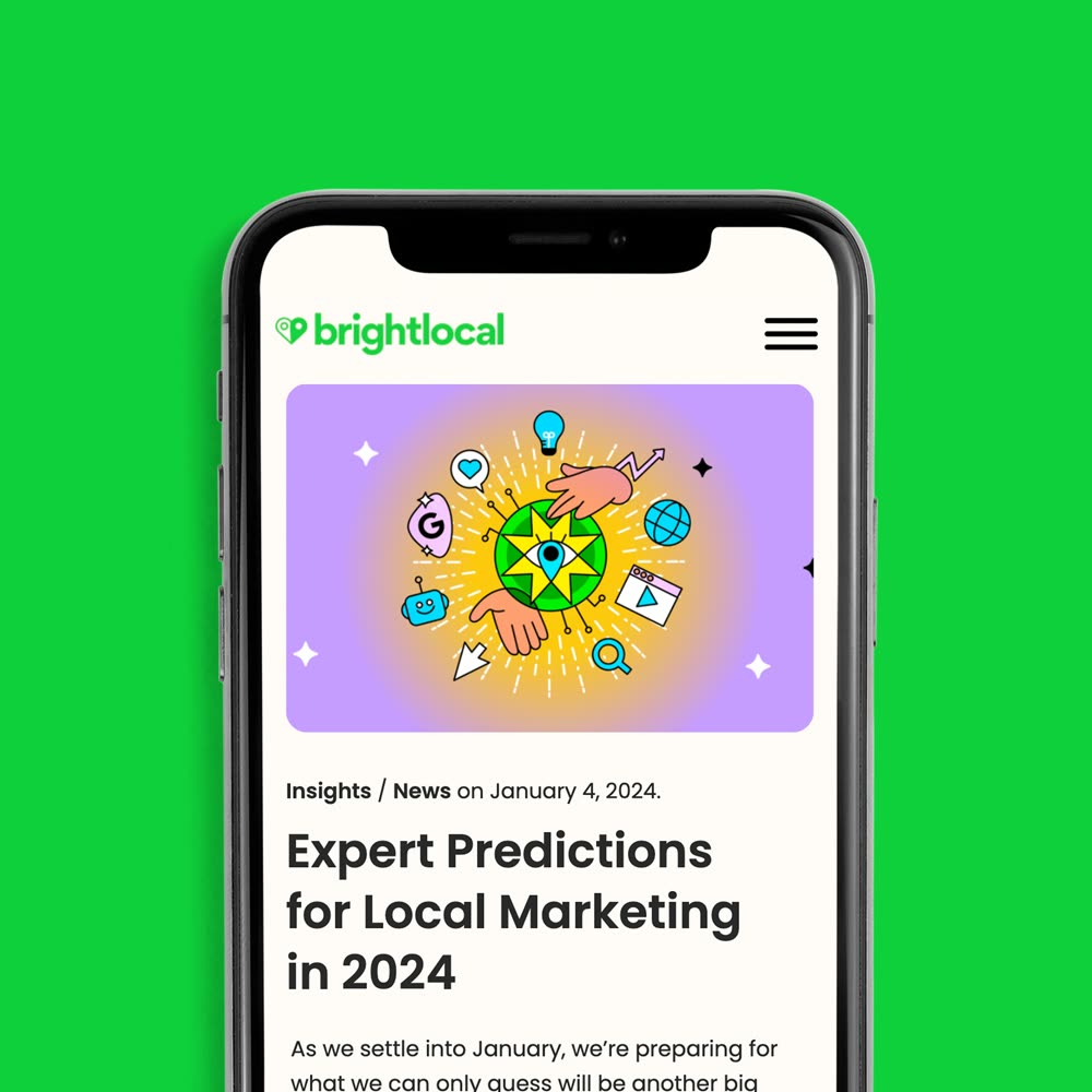
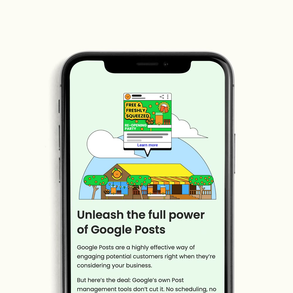
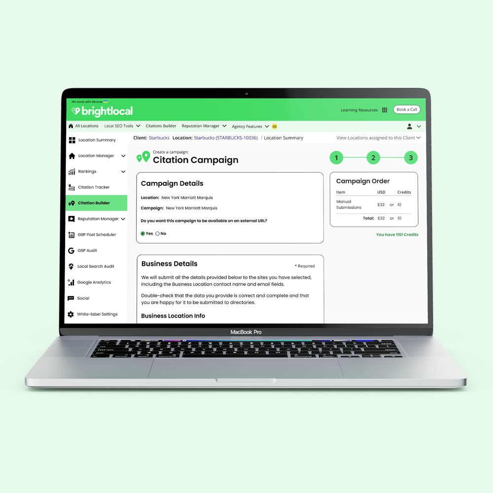
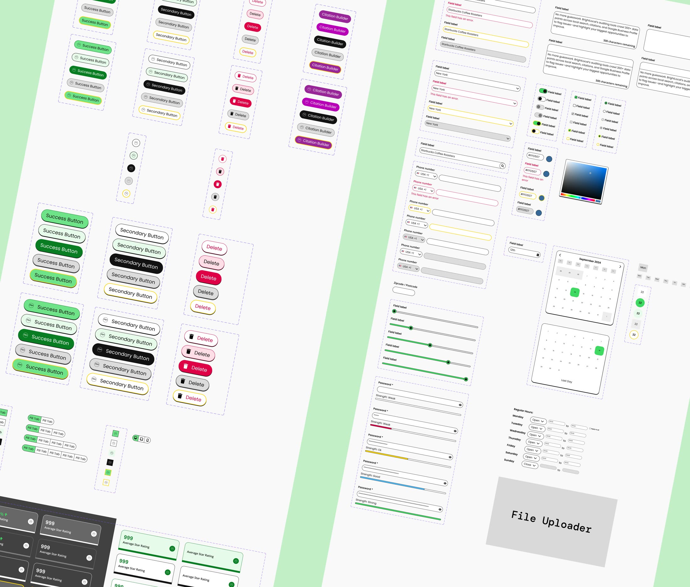
The old product ran on three platforms stitched together, so every new feature looked slightly different from the last. I led a new design system from scratch, built on the brand principles and shared by marketing and product.
A token naming convention gave designers and developers one language. On the website, the homepage bounce rate fell by 16%, and new features and campaigns shipped faster because nobody was starting from zero.
05 — Product
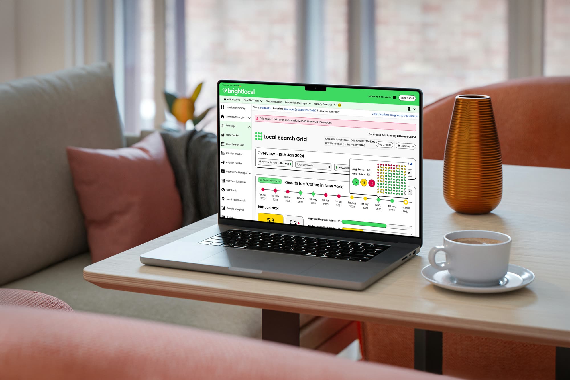
Carrying the brand into the product
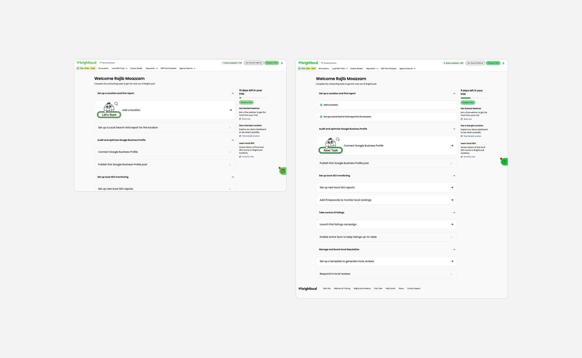
New users now add their first business location during sign-up, so live data is waiting when they arrive. A dashboard of task cards teaches the platform step by step, with a small celebration each time one is done.
Week-one retention rose from 2% to 9%, and activation improved by 28%.
06 — Brand experience
Brand salience, built one conference at a time
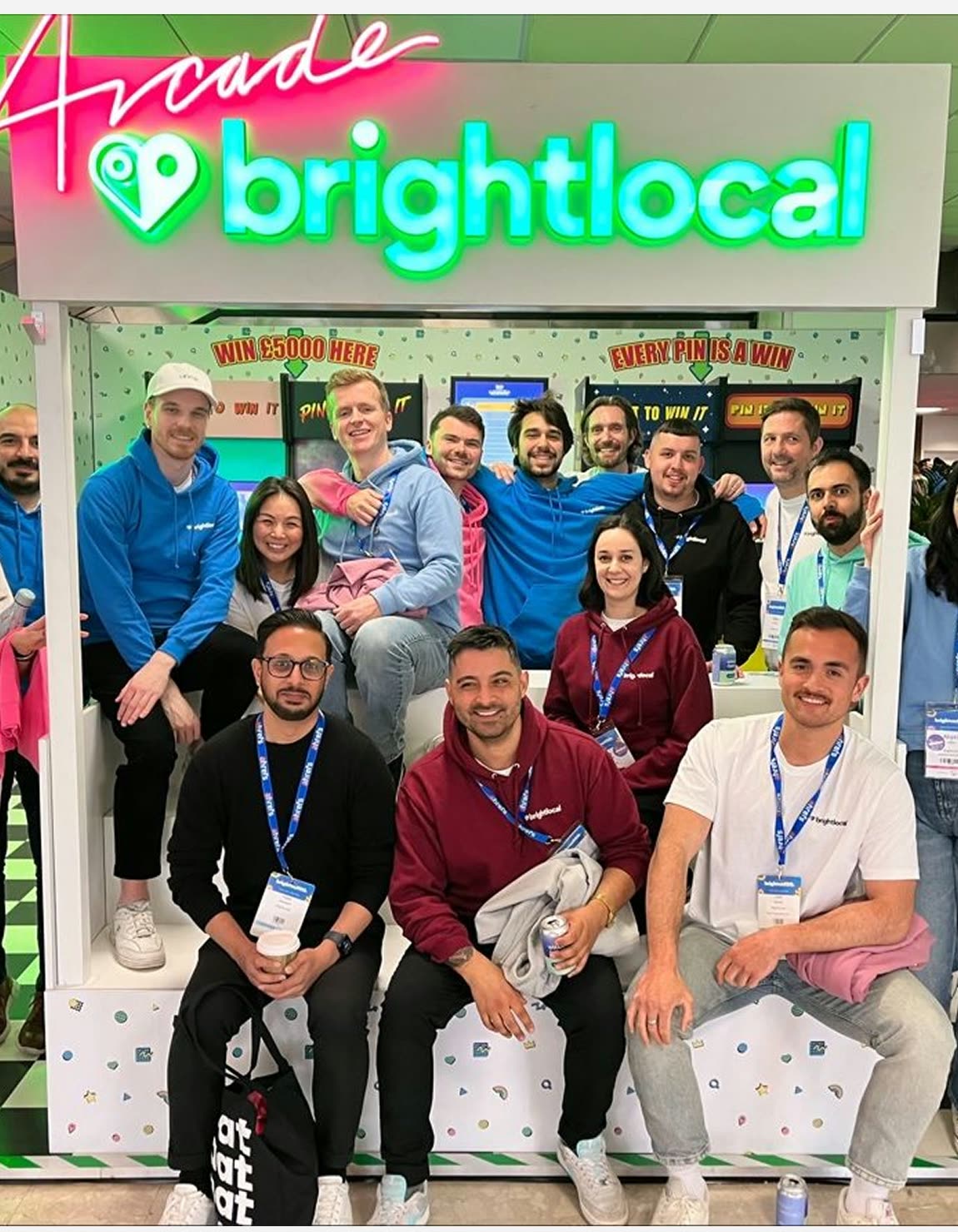
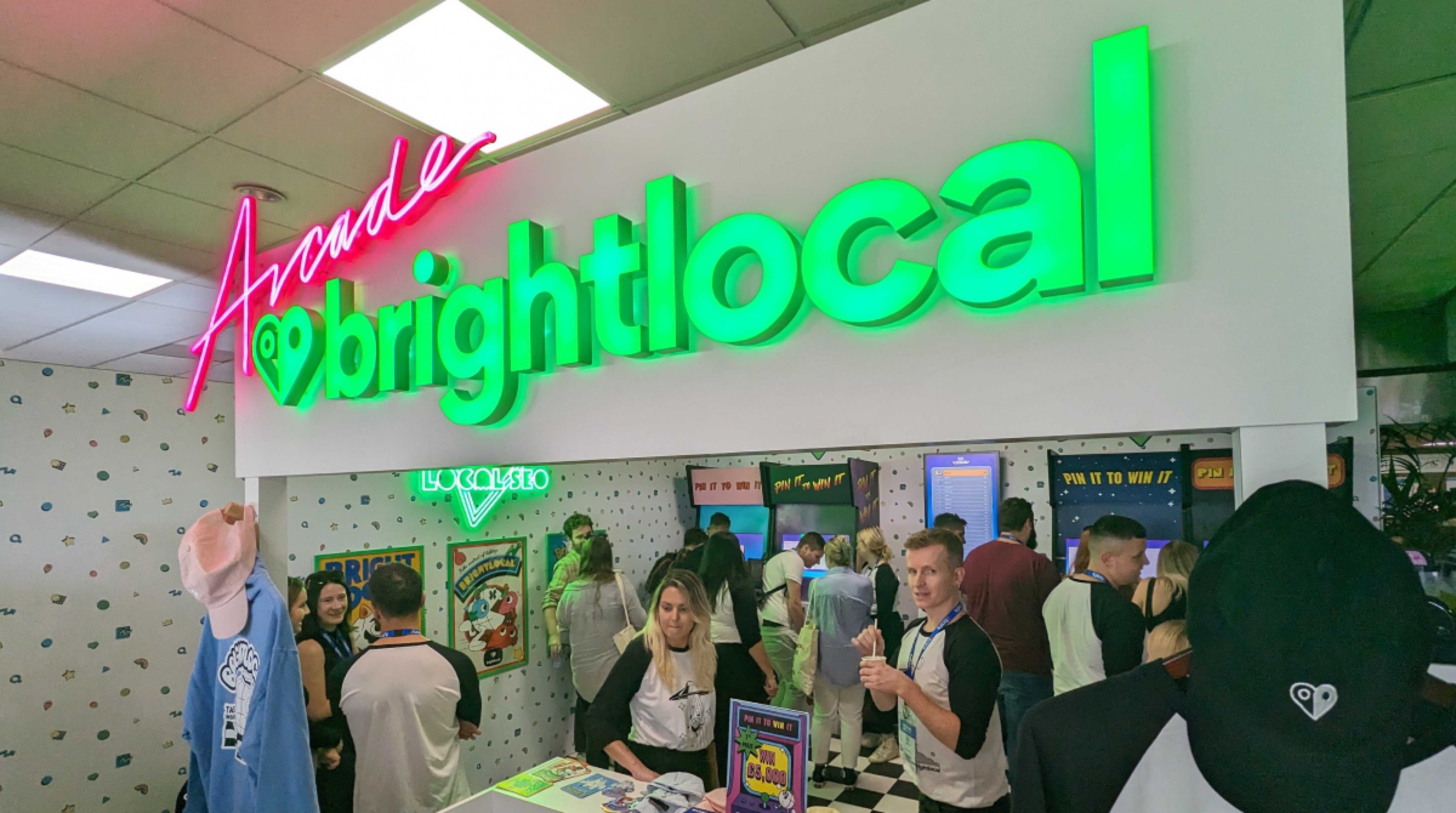
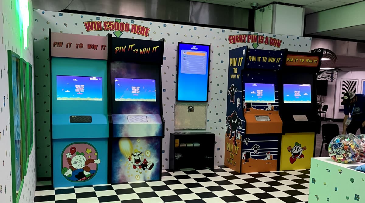
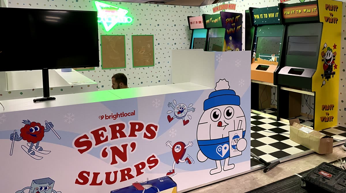
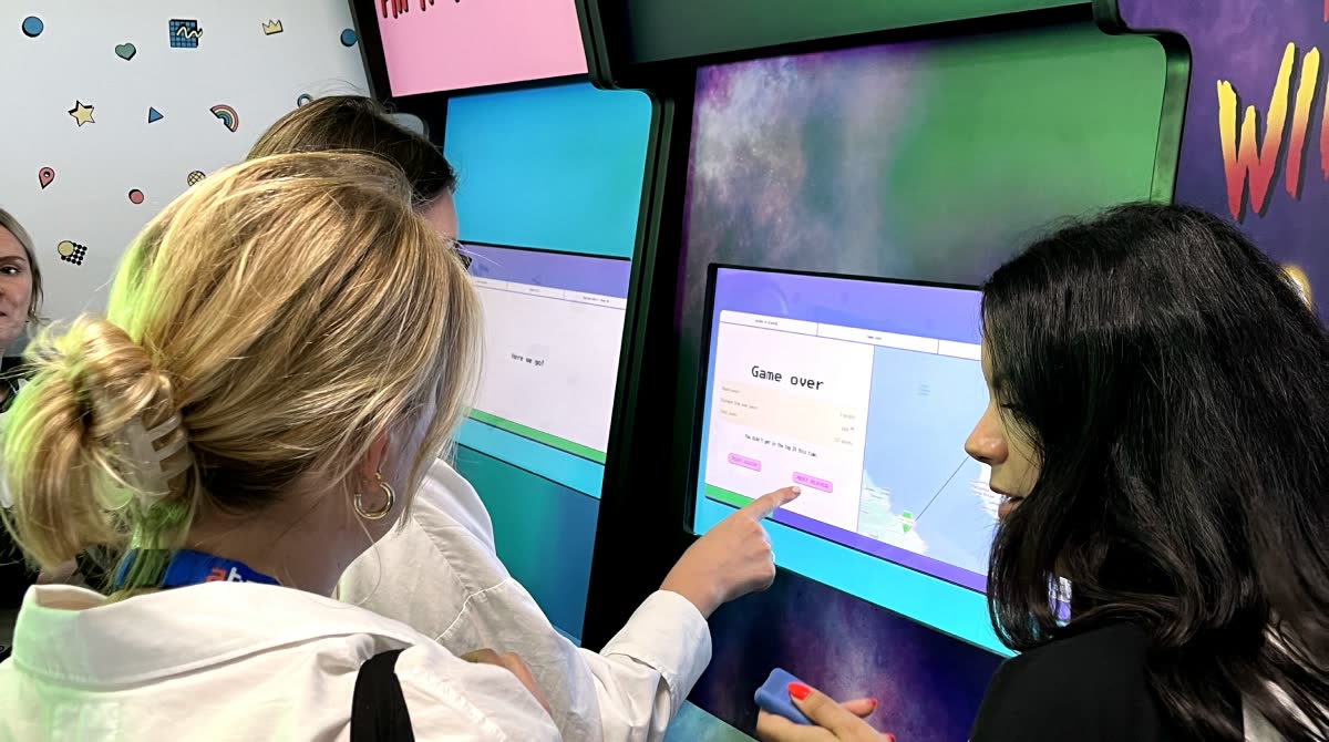
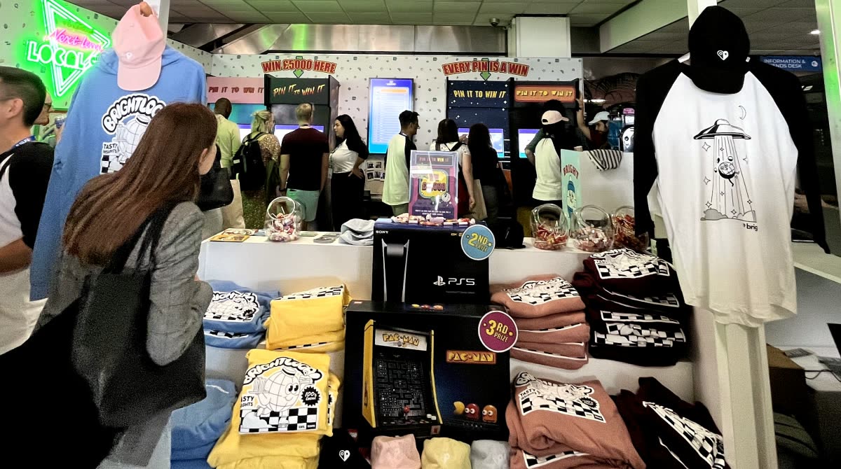
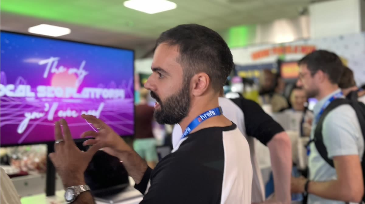
Conference stands are usually a corporate affair. Ours was an arcade. Visitors played for merch as prizes, and the sales team demoed the product in the middle of it.
The goal was brand salience. I wanted enterprise buyers to know who BrightLocal was long before they needed us. At first the events only covered their costs, with a small margin on top, and that was fine.
It works on a long cycle. People from some of the UK's best-known brands met us at these shows once or twice a year. Around eighteen months later, as their agency retainers came up for renewal, they came back to talk.
The stand won best in show, and I was later asked to present to competitor brands on how it was done.
3,566
Visitors scanned in, the most visited stand of the event
64
New leads for the sales team
£1.2M
Revenue so far, all from enterprise brands
6,000+
Social interactions
07 — Team
Fewer product managers, more designers
I inherited a team of four, with two UX designers serving five product managers. Everything bottlenecked through design.
I grew the team to 16, with UX going from two to six and designers embedded in squads alongside engineering. Ideas were researched and prototyped before they reached a developer.
BrightLocal had stood still for two years. Within six months of the redesign it was growing again.